


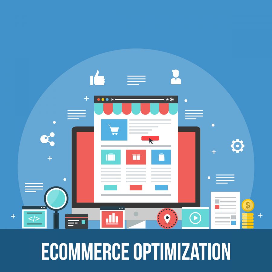
Don’t Make Me Think is a popular book by Steven Kurg and it explains the ways to optimize your e-commerce store. In this article, I’ve extracted 7 ways from the book that are based on extensive studies and prove helpful in e-commerce optimization. It doesn’t only help the e-commerce platforms to create a high-quality user experience for their customers but also impact their buying decision and improve the conversion rate of e-commerce platforms.
Let’s jump into 7 these 7 wise thoughts;
- Ease the consumer journey
The first thing that comes to the mind when we talk about ease of use is how easy a consumer can purchase on your store. If it is a smooth and easy journey, then you’re succeeding at providing him ease of use and high-quality user experience. If it isn’t easy & smooth, then you’re letting down your consumers and it would negatively impact their buying decision. Keep the process simple and easy. An easy consumer journey would be, landing at your store, product search/discovery, product page, cart, checkout, and confirmation – anything in between the journey would be a hindrance in creating the highest-quality ease of buying.
- Keep it simple for them and don’t make them think
One of the wise ways for e-commerce optimization to increase the conversion rate & sales is keeping the process simple. Don’t make them think and help them land straightly to their intended goal at your destination. This requires to work on the technical aspects of design including navigation menus, categories, and the complete buying process. Design every page in a way that it is self-evident. An expert e-commerce development agency offers ideal web design.
- Click buttons should be clearly visible
If your customer wants to proceed to the next thing, then the option to proceed next should be easily available to them. This requires to present them click buttons right at the positing where they should be. For creating the highest-quality user experience for your consumers, providing your best path is essential. The click buttons should be visible and must be placed in the right position.
- No one reads a web-page, so make it easy to understand in a stare
Only 28% of the users read a page at an e-commerce store. A web-page design should be in an F-shaped pattern. It should be designed in a way that you don’t have to embed all the content in a single section. Make a good distribution of text and images or try to convey most of your message with infographics rather than lengthy paragraphs for reading.
- The lesser, the better
As it is said in the above point that doesn’t stuff your web-pages with text and doesn’t try to elaborate things. Apply “The lesser, the more” technique to your web-pages. No one tries to read your whole content but they want to understand everything with a single scan or stare. Keep it straightforward and only wrote what is needed and omit unnecessary words or information from the content. Only write what is most-relevant.
- Clear navigations menus
If your consumer thinks he’s not on the right page and wants to start over, then it is important to present him the “Home” button. Apart from the “Home” button, other navigation menus should also be visible. An expert e-commerce development agency always design an e-commerce store with visible navigations.
- Testing is critical for your e-commerce optimization
If your consumers are not having a good time at your site and you’re facing downfall, then the first thing to do is testing. This is something that should be done right from the start and should continue until eternity.